Difference between revisions of "Scatter Plots"
(→How to label the dots on a scatter plot) |
|||
| (4 intermediate revisions by 2 users not shown) | |||
| Line 28: | Line 28: | ||
|- | |- | ||
| Step 8 | | Step 8 | ||
| − | | Change the min and max values on the axes by selecting Horizontal axis or Vertical axis | + | | Change the min and max values on the axes by selecting Horizontal axis or Vertical axis and changing min and/or max values to new values |
|} | |} | ||
''contributed by Sara Dalton'' | ''contributed by Sara Dalton'' | ||
| Line 51: | Line 51: | ||
|- | |- | ||
| Step 5 | | Step 5 | ||
| − | | | + | | Under series, select or type in the range of the third column that contains the labels |
|} | |} | ||
| Line 64: | Line 64: | ||
''contributed by Sara Dalton'' | ''contributed by Sara Dalton'' | ||
| + | |||
| + | ==Image of scatter plots associated with different values of r== | ||
| + | |||
| + | [[File:Scatter_Plot_and_r.png||test]] | ||
| + | |||
| + | |||
| + | Image link: https://stackoverflow.com/questions/7631799/what-does-correlation-coefficient-actually-represent | ||
| + | |||
| + | ''contributed by Sara Dalton'' | ||
| + | |||
| + | ==What is a scatterplot?== | ||
| + | |||
| + | A '''scatterplot''' shows the relationship between two '''quantitative variables''' measured on the same '''individuals'''. The values of one variable appear on the horizontal axis (x axis) and the values of the other variable appear on the vertical axis (y axis). Each individual in the data set appears as a point on the graph. | ||
| + | |||
| + | A '''quantitative variable''' takes number values that are quantities - counts or measurements. Number of people and household income are quantitative variables. | ||
| + | |||
| + | An '''individual''' is an object described in a set of data. Individuals can be people, animals, or things. | ||
| + | |||
| + | '''Scatterplots''' are the only choice for displaying the relationship between two quantitative variables. For a single quantitative variable, there are many choices for displaying its distribution, including dotplots, histograms, boxplots and stemplots. | ||
| + | |||
| + | Reference: | ||
| + | |||
| + | Daren, S. S., & Tabor, J. (2020). ''Updated version of the practice of Statistics (Teachers Edition)'' (Sixth Edition). W H FREEMAN & CO LTD. | ||
| + | |||
| + | ''contributed by Katie Ciskowski'' | ||
Latest revision as of 19:12, 4 May 2022
Contents
How to create a scatter plot in Google Sheets
| Step | Action |
|---|---|
| Step 1 | Select two columns of data (first column will be graphed on the x-axis and second column will be graphed on the y-axis) |
| Step 2 | Words in row 1 of the columns will be labels for x- and y-axis |
| Step 3 | Select Insert Graph |
| Step 4 | Under Chart Type Select Scatter |
| Step 5 | Select Customize tab to edit the chart |
| Step 6 | To add a trendline, select series and check trendline |
| Step 7 | To add Pearson Correlation Coefficient (r), select series and check show R^2 |
| Step 8 | Change the min and max values on the axes by selecting Horizontal axis or Vertical axis and changing min and/or max values to new values |
contributed by Sara Dalton
How to label the dots on a scatter plot in Google Sheets
| Step | Action |
|---|---|
| Step 1 | Create a scatter plot which includes three columns--two columns of data and a third column of labels |
| Step 2 | X-axis is first column of data |
| Step 3 | Series is second column of data |
| Step 4 | Edit Series to add labels |
| Step 5 | Under series, select or type in the range of the third column that contains the labels |
contributed by Sara Dalton
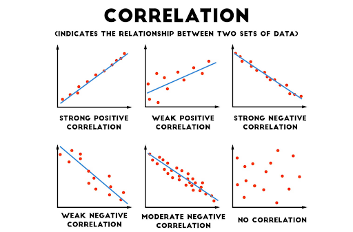
Image of different types of correlation
Image link: https://medium.com/@dipti.rohan.pawar/correlation-statistical-analysis-9471411f0431
contributed by Sara Dalton
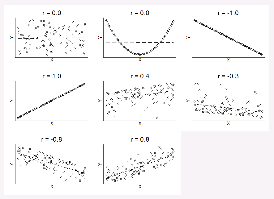
Image of scatter plots associated with different values of r
Image link: https://stackoverflow.com/questions/7631799/what-does-correlation-coefficient-actually-represent
contributed by Sara Dalton
What is a scatterplot?
A scatterplot shows the relationship between two quantitative variables measured on the same individuals. The values of one variable appear on the horizontal axis (x axis) and the values of the other variable appear on the vertical axis (y axis). Each individual in the data set appears as a point on the graph.
A quantitative variable takes number values that are quantities - counts or measurements. Number of people and household income are quantitative variables.
An individual is an object described in a set of data. Individuals can be people, animals, or things.
Scatterplots are the only choice for displaying the relationship between two quantitative variables. For a single quantitative variable, there are many choices for displaying its distribution, including dotplots, histograms, boxplots and stemplots.
Reference:
Daren, S. S., & Tabor, J. (2020). Updated version of the practice of Statistics (Teachers Edition) (Sixth Edition). W H FREEMAN & CO LTD.
contributed by Katie Ciskowski

