Difference between revisions of "Interquartile ranges"
(Created page with "The Interquartile range represent the middle 50% of the data represented within a particular box and whisker plot. When looking at data from a box and whisker plot it is pert...") |
(No difference)
|
Latest revision as of 17:05, 28 August 2019
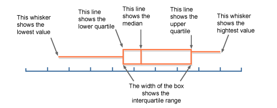
The Interquartile range represent the middle 50% of the data represented within a particular box and whisker plot. When looking at data from a box and whisker plot it is pertinent that you are able to identify various components of the diagram as they relate to the percentage of the data. The diagram below illustrates the various integral components of a box and whisker plot.

Points of Clarification:
-The data point labeled the "lower quartile" represents Q1
-The data point labeled the "upper quartile" represents Q3
-The data point labeled the "median" represents Q2
The INTERQUARTILE RANGE of the data is calculated by subtracting Q1 from Q3.
Formula for Interquartile range = Q3 - Q1.
The box and whisker plot is broken into four 25% pieces. The interquartile range represents the middle 50% (ORANGE AREA in the diagram above).
.*Outliers and extreme values will fall outside of the interquartile range*.
Submitted By Damien Holst
