Difference between revisions of "The Box Plot"
(→Creating a Box and Whisker plot) |
|||
| Line 48: | Line 48: | ||
''contributed by Michael Minzloff'' | ''contributed by Michael Minzloff'' | ||
| − | == | + | == Manually creating a box and whisker plot == |
Box and Whisker plots show the variability of a data set. In order to make a box and whisker plot, you need to know | Box and Whisker plots show the variability of a data set. In order to make a box and whisker plot, you need to know | ||
Revision as of 07:45, 20 April 2022
Contents
Boxplots
Boxplots can be used to explore distribution of one continuous variable for the whole sample or, alternatively, the researcher can search for scores to be disagregated by different groups. The output from boxplot gives the researcher a lot of information about the distribution of the continuous variable and the possible influence of the categorical variable. A boxplot allows the researcher to inspect a pattern of scores within each group and allows visual inspection of the differences between groups (Pallant, 2016).
Contributed by Joseph W. Sullivan
Creating a box and whisker plot using SPSS
(Refer to emailed file for screen-shots and further assistance)
1) Open SPSS and EXCEL
2) Copy the data (into SPSS) that you would like to use. For example, test scores disaggregated by gender. Make sure that you assign numbers to gender (In example below: 1 = male; 2 = female).
3) Once data is entered into SPSS (as depicted above), click on: “Graphs boxplot”
4) Click “define” (with “simple” & “summary for groups of cases” chosen)
5) Move “test” (or your variable of choice) into the variable section
6) Move “gender” (or whatever you choose) into the “category axis” section.
7) Click OK.
8) In order to format in APA, double click on the graph in SPSS. Change each axis to read what you would like them to read.
9) Close the “chart editor” and copy and paste your final graph from SPSS into your document of choice.
10) Have a drink to congratulate yourself on a job well done. Please note: this step is not in the latest version of APA).
contributed by Chris Longo
What is a Box Plot and When is It Used
The box plot or box-and-whisker plot is a graphic, created by John W. Tukey, used to show the distribution of a set of data. It is frequently used with data that can also be represented with a histogram, but the box plot shows more information than a standard histogram. For example, the box plot is useful to researchers because it shows extreme scores.
How to Read a Box Plot
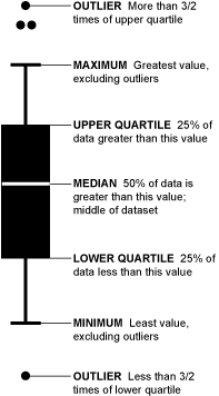
Let's say we ask 282 people how many pairs of shoes they've consumed in the past ten years. We'll sort those responses from least to greatest and then graph them with our box-and-whisker. See the example above.
Take the top 50% of the group (142) who bought more pairs of shoes; they are represented by everything above the median (the white line). Those in the top 25% of shoe buying (71) are shown by the top "whisker" and dots. Dots represent those who bought a lot more shoes than normal or a lot less than normal (outliers). If more than one outlier bought the same number of shoes, dots are placed side by side.
contributed by Michael Minzloff
Manually creating a box and whisker plot
Box and Whisker plots show the variability of a data set. In order to make a box and whisker plot, you need to know Five Number Summary
1) Least value
2) Greatest Value
3) Quartile 1
4) Quartile 3
5) Median
For example, if you had a set of numbers and sorted the following from least to greatest on basketball scores for your team during the school year.
14, 15, 20, 26, 27, 30, 30, 30, 33, 35, 36, 38 (least number would be 14, Q1 =23, median =30 Q3=34 and greatest value is 38) Show your kids to make a number line. In this instance, it would be counting up to 38 from 14 by 2's Put a dot above 14 and above 38 which are your least and greatest.
Then put vertical lines above your Q1 which is 23, Median which is 30 and Q3 which is 34. Connect the lines to make a box with 23, 30 and 34. Then extend a vertical line from 23 to 14. This is the whisker because it is outside the box. Do the same with the other side of your box which would be to extend a line from 34 to 38. That is the other whisker. There you have it! You have not only learned how to read The Box Plot and but also how to create it.
contributed from Tania Nicole Sutherland
How-to Video
How to create a box and whisker plot using SPSS [1]
contributed by Jen Eraca
