Scatter Plots
How to create a scatter plot in Google Sheets
| Step | Action |
|---|---|
| Step 1 | Select two columns of data (first column will be graphed on the x-axis and second column will be graphed on the y-axis) |
| Step 2 | Words in row 1 of the columns will be labels for x- and y-axis |
| Step 3 | Select Insert Graph |
| Step 4 | Under Chart Type Select Scatter |
| Step 5 | Select Customize tab to edit the chart |
| Step 6 | To add a trendline, select series and check trendline |
| Step 7 | To add Pearson Correlation Coefficient (r), select series and check show R^2 |
| Step 8 | Change the min and max values on the axes by selecting Horizontal axis or Vertical axis and changing min and/or max values to new values |
contributed by Sara Dalton
How to label the dots on a scatter plot in Google Sheets
| Step | Action |
|---|---|
| Step 1 | Create a scatter plot which includes three columns--two columns of data and a third column of labels |
| Step 2 | X-axis is first column of data |
| Step 3 | Series is second column of data |
| Step 4 | Edit Series to add labels |
| Step 5 | Under series, select or type in the range of the third column that contains the labels |
contributed by Sara Dalton
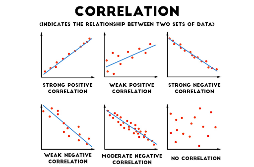
Image of different types of correlation
Image link: https://medium.com/@dipti.rohan.pawar/correlation-statistical-analysis-9471411f0431
contributed by Sara Dalton
